Customer Satisfaction Poll
Strangely enough, 100% of respondents to this poll reported 0% satifaction..

read more and comment..
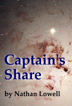
Captain's Share
 Last year, I wrote about Ishmael Wang's
blossoming career on the ships within Nathan Lowell's wonderfully realised future universe of inter-galactic
trading.
We last heard of Ishmael when he'd made it to full share and there's been an excrutiatingly long silence as we wait to
hear more of his story. But Nathan was on a promise - it was coming!
I must admit I was wondering whether the latest installment would keep up the high standards that Mr Lowell has set for
realistic, humanist, hard sci-fi. But now that I've started reading ("listening") to Captain's Share, I know my worries are for naught.
If you think it is remotely possible, I'd say that Nathan Lowell has met and exceeded the standards of story-telling
that he set with the earlier books in the saga.
If you are not familiar with the Age of the Solar Clipper, I heartily
recommend you start way back at the beginning and work through the series - you won't be disappointed! Not only does
Nathan deliver intriguing hard science, but the situations into which he places his characters are model studies of
human behaviour (and even management science)... not to mention the few culinary tips I've picked up along the way!
Here's the series (so far) in it's entirety:
- Quarter Share
-
- Half Share
-
- Full Share
-
- (an interlude [side story] South Coast)
-
- Captain's Share
All of these stories are wonderfully available for free download in audio format from podiobooks.com: read by the author in an utterly engaging way that only the creator could muster.
When I say "so far" I really mean it: Nathan Lowell has created an alternate universe/future so compelling and detailed that I can imagine (and eagerly await) many more stories drawing from the rich canvas he has created. So many more possibilities than even the Star Trek and Star Wars franchises ... and probably more in the league of the Dune and Foundation sagas ...
read more and comment..
Project Nimbus: Gov.sg 2.0 gaining momentum!
I was excited to hear about the Project Nimbus initiative at last night's
SRB meetup (Jason's
the great
Gladwellian connector)
When I wrote my opinion piece "Could Open Government
initiatives help drive innovation in Singapore?", I had in mind a key proposition that it would be really smart for
Government to push open data initiatives, as any costs or concerns associated would be repaid many times over by the
resulting stimulus to local innovation and economic development.
With that in mind, it's really heartening to see that some cool cookies have gone beyond just talk, and established
Project Nimbus with the goals:
-
- To unite the voices of Singapore Innovators and identify data sets and services we as Innovators want
-
- To work with content owner and government entities for the appropriate release of these data sets and services to Singapore Innovators
-
The main engagement point is the UserVoice page they have setup to collect and filter ideas (through the voting process). This is a great way of first making sure you are dealing with ideas that have real support and interest.
Once you have qualified ideas, the next steps are where Project Nimbus could make the difference from every other idea that ever got sent up only to have its wings fold on launch: make sure you have the idea packaged in a Government/agency-friendly way, and then ensure the message gets through to the right people (who care, and have appropriate authority).
As we were discussing yesterday, good ideas without execution are .. nothing but wishful thinking really. It seems like Project Nimbus has all the right bases covered. It will be really exciting to see the first successes start to come through (they already have two ideas progressed to the stage of taking to the agency concerned).
This could be a really interesting year;-)
read more and comment..
Rails authentication with Authlogic and RPX

The Singapore Ruby Brigade had it's monthly meetup last
night. Great discussions as always, and how can you complain when you get to carry on over maggi mee goreng supper
until the wee hours;-)
Here are the slides from my talk about Rails authentication options in general, and specifically why and how to use
RPX with Authlogic (using the
Authlogic_RPX gem I released last week).
read more and comment..