Dipity is an experiment in information organisation, with time being the primary dimension currently being explored. Similar in a way to MIT's SMILE widget, which I was investigating a while back for visualizing time-based information.
Dipity shows a great deal of promise, and I like its emphasis on self-discovery and organisation information if directed (rather than everything having to be painstakingly entered). It is certainly a fun way to get lost for a few hours and learn a whole lot of stuff you never set out to study (just go to the home page and start checking out different timelines!)
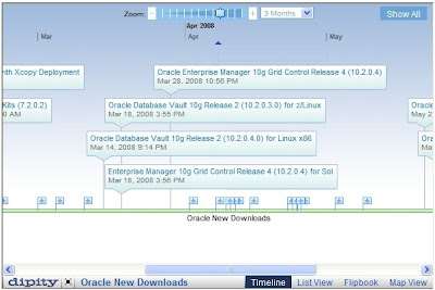
Ulrich has already worked up a history of Oracle Releases. Not complete, but a fantastic visualisation that would be worth supporting and maintaining!
NB: I'm posting a static image here for now, because the embed code doesn't seem to work in all browsers at the moment.